AI-generated Summaries for Artifacts
Published January 2024
Overview
Work artifacts are real life examples of work that the Reforge community can learn from and use in their own work.
In an effort to help bolster our WAU retention rate, I lead an initiative to improve the usefulness of work artifacts for our users.
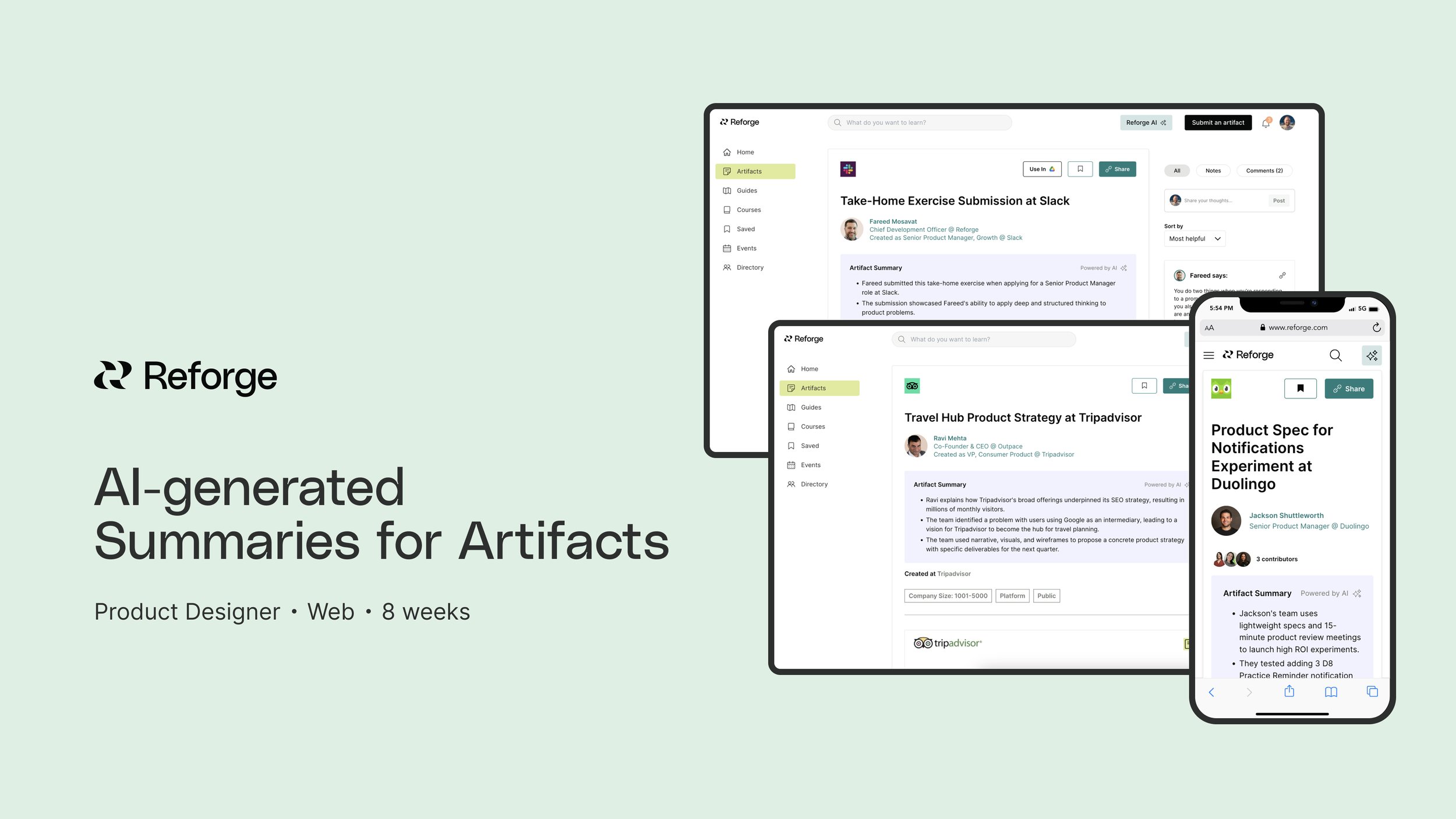
The result was a feature that uses AI to create short, succinct summaries at the top of each artifact to help users assess relevancy and get top takeaways during the browsing experience.
My Role
Product Design
Discovery Research
Goal
Ensure users are getting value out of every artifact they view so that they continue to return and engage with artifacts over time.
Discovery
🤔 Why did we do this work?
After we launched Artifacts to the public over the summer, a top business goal for my team was improving our WAU (weekly active user) retention metric for users.
To this end, I spent a lot of October conducting discovery research aimed at better understanding how we might make artifacts more helpful & useful to users.
I launched an in-product survey using Sprig that surveyed users while they were in the experience of viewing an artifact. The target segment was free and paid users who had viewed at least 3 artifacts during their session.
The prompt asked users to rate the usefulness of artifacts on a scale of 1 (least useful to 5 (most useful), and followed with the simple open question, “How could we make this artifact more helpful to you?”
The survey concluded by asking if the user would be willing to chat with us more about their experience.
1️⃣ Quantitative data

Sprig survey results
2️⃣ Qualitative data
Top takeaways
While I was thrilled to see a high percentage of users finding artifacts useful, I was interested in talking more with users who rated them 4 and below on the scale to gather qualitative feedback and dig deeper into the problems they were facing in their own work to understand how artifacts could be more helpful.
Some notable quotes from customer calls:
“When opening an artifact it is hard to understand why or if it is relevant to me. ”
“Not everything here is relevant to me so how can I find what I want faster.”
💡TLDR: October was a month of UXR insight!
After running the Sprig survey for 26 days and following up for 30 minute calls with 8 users, I was starting to form some top takeaways to inform my next moves.
The top theme that emerged was around users asking for improved artifact context and relevance.
Users are often quickly browsing and want to be able to understand if an artifact is relevant to them and skim a high-level summary of an artifact. Two specific examples that came up as themes:
Providing more context while browsing that better helps users quickly understand what and artifact is and if they are interested in it. Concepts, keywords, and topics are all words that were used to describe what is meant by added “context” of an artifact.
Multiple users talked about wanting high-level summaries, or bullet points, at the top of artifacts that quickly give them the takeaways so they can skim.
Wireframes and Ideation
Creating some conceptual wireframes in FigJam was a really helpful way to start translating what I had learned during my research into possible ideas. My intent was to think big at first, and then use team feedback to begin narrowing in on a solution to invest more time in.
I time-boxed myself to a day of wire-framing some possible ideas on how we could inject more context into the experience of viewing an artifact, thinking about the user pain point of relevancy in the browsing state.
Through jamming with my design colleagues, workshopping the wireframes with my immediate team, and bringing in vital stakeholders for their feedback, I took the direction of these initial ideas from this…

… to this direction, which focused on using AI to generate top takeaways on specific artifacts.

By talking through the technical requirements of a feature like this and assessing timeline, I decided to pursue a V1 of this feature that was lightweight, simple, and baked into the UI of the artifacts detail page.
The idea was that it would not require action from the user, and it would be placed prominently at the top of the detail page so it was one of the first things users would interact with during that first discovery moment when viewing an artifact.

Leveraging generative AI
Leveraging generative AI was an important piece of this design in order to prevent shipping a feature that created a ton of extra work for our Content Creation team, who are responsible for maintenance of artifacts in our CMS.
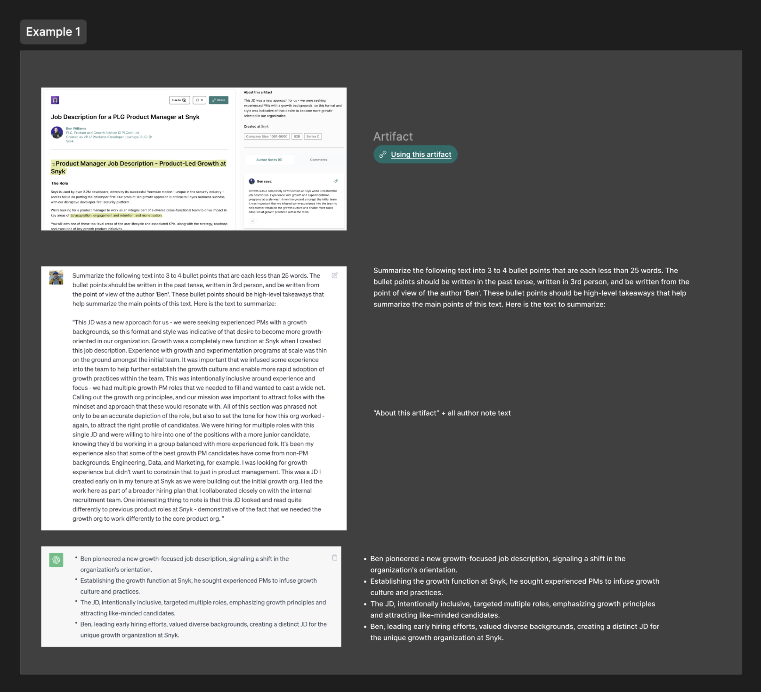
I used ChatGPT 4 to test various prompts that would give us the kind of Summary output that would be most helpful to users: short, snack-able high-level takeaways for each artifact.
I tested the prompt and fine-tuned it based on different types of artifacts from various functions, containing varied amounts of text (some artifacts are more visual in nature, and so it was important to account for all types).
It was important that the prompt I included in my design work would make our team faster and guarantee a quality output that wouldn’t need human intervention.
This became my proposal:

Once I had a prompt that was consistently giving me a quality output, I pressure-tested it again on some examples that I would share with the team during hand-off.
These examples helped secure buy-in on how quickly these summaries could be created, and the quality of their content. It also served as a guideline in the process of using OpenAI as our engineering team worked through integration.


Visual design
The component for the AI Summary that shipped was simple and prioritized skimmability. It needed to stand out, but not distract from our core actions and primary CTAs. It needed to be a focal point of the hero section of the artifact.
We also included an AI tag to let users know how this summary was generated, that it wasn’t in the author’s own voice, and to indicate our company’s investment in AI as a technology.

Some documentation that helped bring the team along with the design proposal:

Initial results
We are seeing that AI summaries are helping users save time and discover more.
To measure initial response to the feature, I setup another in-product survey during our launch to solicit qualitative response and gather some quant data. The survey ran for the first month of the feature’s life.
Of the total users who responded to our survey:
73% of users said they were finding the summaries very helpful
22% said they were somewhat helpful
4% said they were indifferent
1% said they were not helpful
Top qualitative themes
🌹Many respondents told us that these summaries save them time and provide clarity, especially while browsing artifacts
🌹They offered a good starting point in understanding the artifact and what it involves
🌹Helps them assess relevancy and decide if it’s worth their time to read on
🌹Provides a snackable way to digest the artifact and is easy to scan
“It has all the key words and phrases that I can quickly gauge whether they align with my own current hot topics.”
“Helps me understand whether I need to scroll further or not :)”
SEO Improvements
Since launching AI Summaries, we’ve also seen some SEO benefits from published Artifact pages containing these summaries.
The summaries are increasing our ability to land in Google’s featured snippets, as well as boost positioning of page results on topics that are covered by an artifact.


Closing thoughts
This feature was born out of research and trying to hear the problem behind what customers were saying to us: that they needed more help in understanding if an artifact was relevant for them, and wanted to find what they were looking for in our library faster.
We know that a next step is going to be working with our engineering team to streamline the creation flow for these AI Summaries, and enabling users to edit their own.
If you get a chance to check them out, I would love to hear what you think!